
Colours of the South Downs: A nature-inspired approach to choosing colours for your home
- The Room Stylist

- Jan 18
- 2 min read
Updated: Jan 19

Nature is one of the most intuitive and grounding places to begin when creating a colour palette for your home. Colours that sit harmoniously together in the landscape tend to feel equally balanced indoors, a core principle of biophilic design.
I’ve always been drawn to earthy, grounded tones, but this connection has deepened since moving to the South Downs. Living here has made me more aware of how colour in nature is never static, it shifts subtly with light, weather and season, yet always feels cohesive.
During dog walks across the Downs, I find myself constantly noticing how muted greens, chalky whites, and soft sky tones work together so effortlessly. These walks became the starting point for my own home’s colour palette, not as individual paint choices, but as a whole, inspired by a place.
In September, I hiked the South Downs Way, 100 miles over 9 days. The journey took place at that gentle point between summer and autumn, when the landscape begins to soften and deepen in tone. Throughout the hike, I paid close attention to the colours that defined each day: the landscape, the mood, the weather, and the feeling of the place.
From this experience, I narrowed my observations down to nine colours, one for each day of the hike.
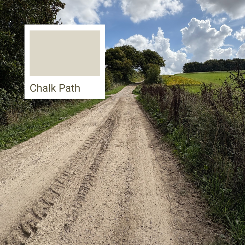
Day 1 - Chalk Path
Inspired by the bright, dusty light of the chalk paths leading out of Winchester.

Day 2 - Butser Storm
Capturing the deep grey moodiness of storm clouds rolling over Butser Hill.

Day 3 - Down Edge Green
Based on the quiet green of the slopes and soft edges of the Downs.

Day 4 - Downland Basil Blush
A softened mauve-pink drawn from wild basil growing along the path.

Day 5 - Chanctonbury Deep Leaf
The dark, earthy green of the beech trees that ring the hilltop at Chanctonbury Ring.

Day 6 - Hawthorn Red Berry
The warm autumn red of hawthorn berries that line so many hedgerows in September.

Day 7 - Inkcap Mushroom
A soft mushroom-neutral inspired by the dusty beige-grey of inkcap fungi on the trail.
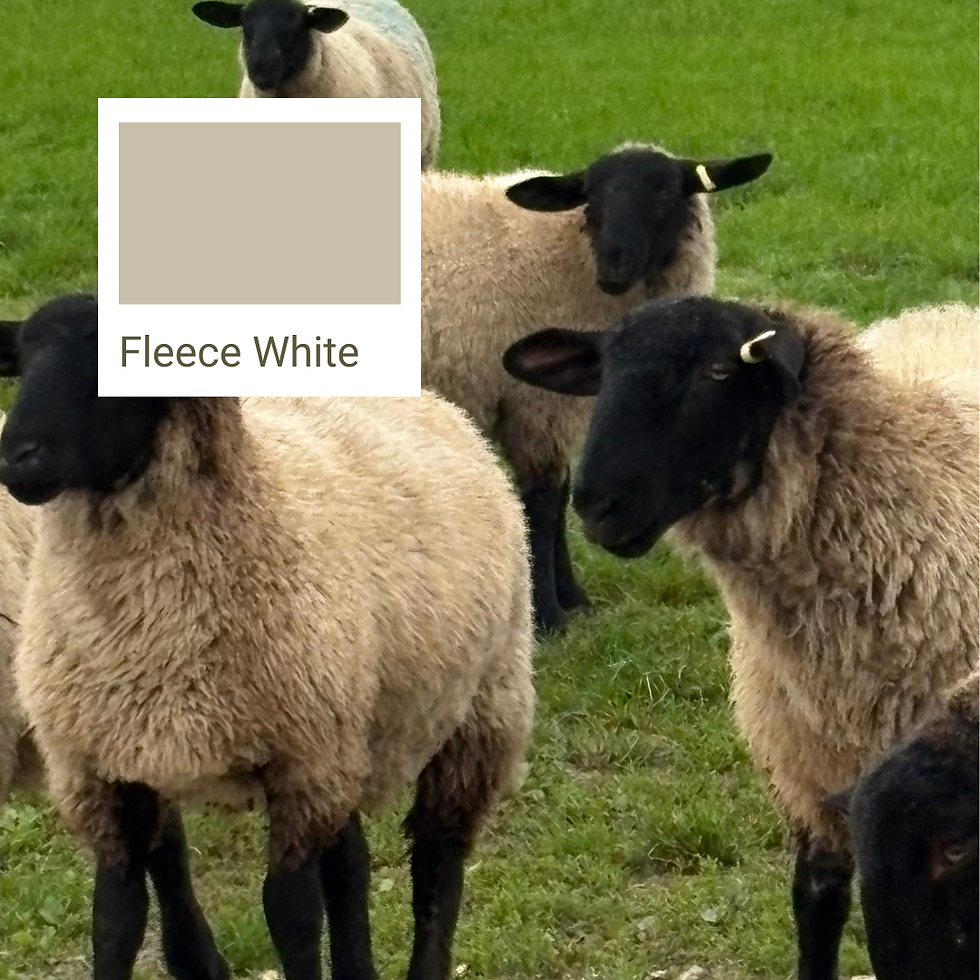
Day 8 - Fleece White
The chalky, slightly greened cream of sheep fleece in the September light.
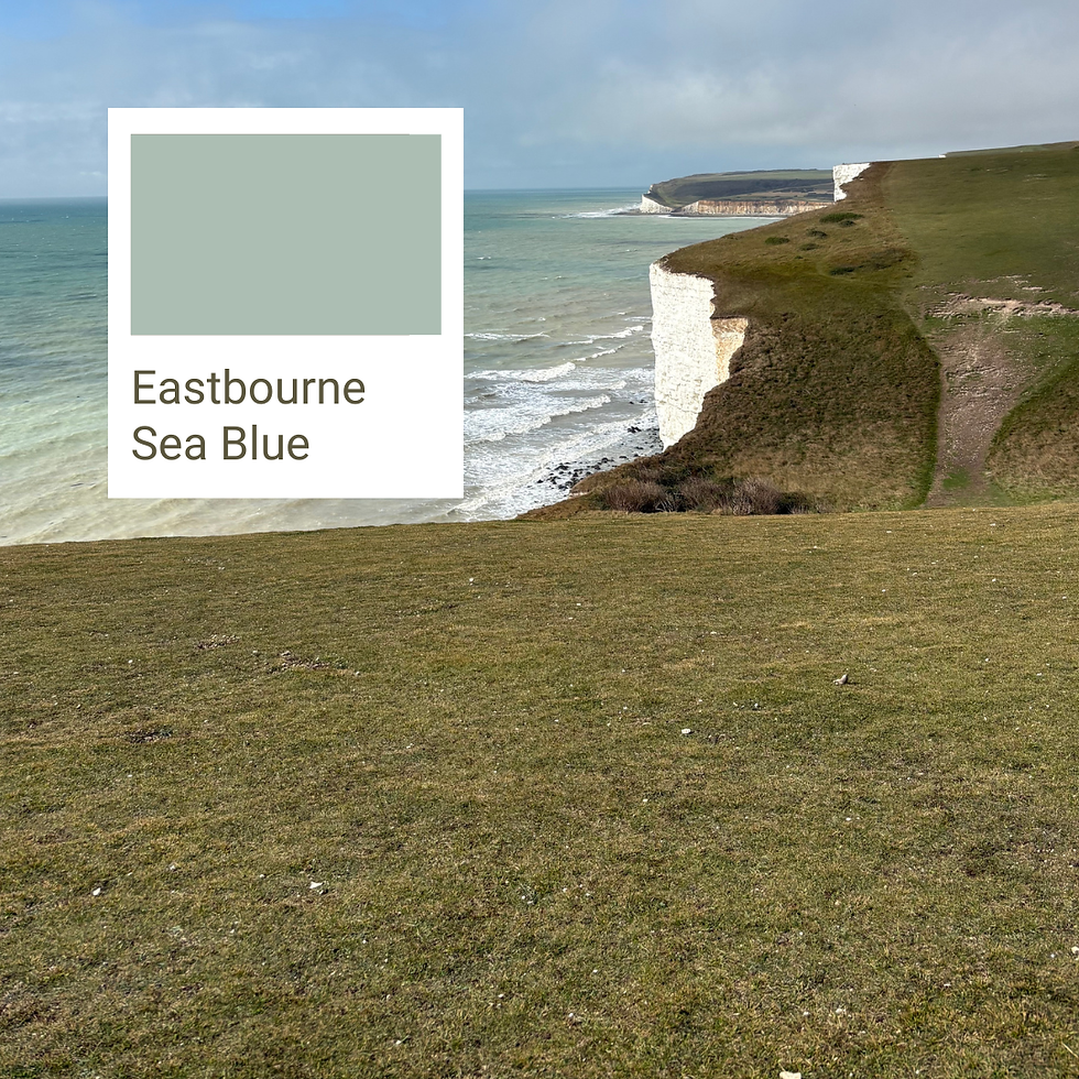
Day 9 - Eastbourne Sea Blue
A cool, muted sea blue reflecting the approach to the coast at the end of the walk.
Using nature as inspiration helps create interiors that feel calmer, more connected and more timeless, spaces that support how we live rather than overwhelm us. It’s a gentle reminder that you don’t need to follow trends to create a cohesive home; often, the best guidance is already around you.

Over the coming months, I’ll be sharing how I’m using this South Downs Way colour palette throughout my own home, from paint choices to how the colours layer and evolve with light, texture and season.
If you’d like to explore other ways to uncover inspiration for your own home, read my Finding Your Inspiration blog and download the accompanying workbook to help you translate what you love into a space that truly feels like yours.

Comments